
Came across this awesome article on a list of Web Design Mistakes we should avoid and decided to share those that I've came across quite a number of them together with my feedback about it. Feel free to leave your comment as well! (*Note: Text in red colored fonts are excerpts from the article.)
The user must know what the site is about in seconds
Attention is one the most valuable currencies on the Internet. If a visitor can not figure what your site is about in a couple of seconds, he will probably just go somewhere else. Your site must communicate why I should spend my time there, and FAST!
My feedback: Agree! I find it hard sometimes when I was blog hopping and had to spend a lengthy time trying to figure out what is the theme of the blog I'm currently browsing. I want to know in a matter of seconds, whether the blog is about parenting, recipes, giveaways, photography, etc. Seriously, I have not much time to be reading every single post in the blog and it's best if I can quickly know what the site is about, then bookmark it so that I can come back to it when I have free time. Else, I'm sorry, I've gotta go and hop on to the next blog!
Now of course, being an owner of a blog myself, I too need to make sure that people who hops into my blog knows what is my site all about. I hope (and pray!) my blog title "I'm a full-time mummy" will give the idea that this site is all about mummyhood experience.
Do not open new browser windows
I used to do that on my first websites. The logic was simple, if I open new browser windows for external links the user will never leave my site. WRONG! Let the user control where he wants the links to open. There is a reason why browsers have a huge “Back” button. Do not worry about sending the visitor to another website, he will get back if he wants to (even porn sites are starting to get conscious regarding this point lately).
My feedback: Oh well, I used to do that too, until I came across this article. I thought by doing this, you guys will never leave my site... I guess that's terribly selfish and controlling of me to be doing that. Agree with what the article said, if the reader wants to get back, they can always press the BACK button... So people, from now on, any URL links I'm referencing to in my blog posts will be opened up in the same window browser, once you're done reading it, you just click the BACK button and continue on...
Do not play music

On the early years of the Internet web developers always tried to successfully integrate music into websites. Guess what, they failed miserably. Do not use music, period.
My feedback: Yeah, I never like going to a blog which plays music on the background. I mean, if you really want to put in a play list, at least put in the option to allow your visitor to switch it on IF they want to hear it. Else, turn it OFF! You have to understand SAH mummies like me can only go online when my kid takes his daytime nap or goes to bed after 10.30pm. Imagine, you get comfy and all and just starting to enjoy a moment to yourself, then you catch up on your blogging and browsing through other blogs and suddenly a loud music blared out in the night, scaring yourself and might even risked waking your child up! So, no music please!
Do not clutter your website with badges
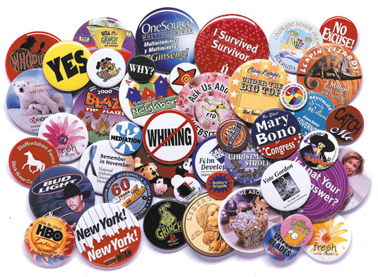
First of all, badges of networks and communities make a site look very unprofessional. Even if we are talking about awards and recognition badges you should place them on the “About Us” page.
My feedback:I truly agree! Even on my old blog, I will put all the badges/buttons into a running script which actually slides each badges/button vertically so that it doesn't clutter up my blog layout. As for my new blog now, I can't put in the script so I make do with putting all those badges/buttons in PhotoBucket, creating a slideshow from it and displaying the code link to the slideshow in my blog's static pages. You can find them at the following pages on my blog:
* My Blog Stuff!
* Cool Blog Memes
* PR Info!
So again, other than my own blog button which I put at my blog sidebar, the rest goes to the above pages.
Make sure to include contact details
There is nothing worse than a website that has no contact details. This is not bad only for the visitors, but also for yourself. You might lose important feedback along the way.
My feedback: Totally agree again! Which is why other than the option to contact me via email, I also frantically searched for the commenting widget to put into my blog since my readers / visitors using IE8 are not able to submit a comment or email on my blog.
Avoid "drop-down" menus
The user should be able to see all the navigation options straight way. Using “drop down” menus might confuse things and hide the information the reader was actually looking for..
My feedback: Uhuh... actually, why I don't like this probably stems from my previous working experience in programming line. I used to write codes in RPG/400 a very dinosaur language (which are still mainly used in banking and financial institutions in Malaysia) and being a dinosaur language, to code a "drop-down" menu is not so easy, so yeah, I guessed it is one of the reason why I don't like seeing "drop-down" menus as well.
No horizontal scrolling
While some vertical scrolling is tolerable, the same can not be said about horizontal scrolling. The most used screen resolution nowadays is 1024 x 768 pixels, so make sure that your website fits inside it.
My feedback: Yeah, it gets tiring having to scroll up and down and then left and right...
If you use CAPTCHA, make sure the letters are readable

Several sites use CAPTCHA filters as a method of reducing spam on comments or on registration forms. There is just one problem with it, most of the times the user needs to call his whole family to decipher the letters.
My feedback: Yeah... actually I don't like having to key in CAPTCHA letters whenever I try to leave a comment but I will close one eye and just go along with it. Now, I get real annoyed when the letters shown are hard to read (yeah, maybe it's not your fault) but having to type over and over again it's really stressing... not to mention those blogs that sometimes reload for every action you take, like you key in your comment, then click submit or post, and it reloads with the CAPTCHA for you to key in, then you key in the CAPTCHA and it reloads with your preview which you will then click (finally) the submit or post button in order to leave your comment. Frustrating!
Okay, that's about most of the common things I encountered during my usual blog hopping activities. Other than the above, I also get annoyed when I hopped into dark colored background. Maybe it's just me, but I tend to stay away from dark background... it also makes reading hard and I really don't want to spoil my eyesight so fast... Hope you guys enjoyed the above and let me know what other common things you encountered as well!
(*Images are taken from Google search)
