Web Design Mistakes To Avoid...

~ Posted on Friday, July 30, 2010 at 9:38 AM ~

Came across this awesome article on a list of Web Design Mistakes we should avoid and decided to share those that I've came across quite a number of them together with my feedback about it. Feel free to leave your comment as well! (*Note: Text in red colored fonts are excerpts from the article.)

The user must know what the site is about in seconds
Attention is one the most valuable currencies on the Internet. If a visitor can not figure what your site is about in a couple of seconds, he will probably just go somewhere else. Your site must communicate why I should spend my time there, and FAST!

My feedback: Agree! I find it hard sometimes when I was blog hopping and had to spend a lengthy time trying to figure out what is the theme of the blog I'm currently browsing. I want to know in a matter of seconds, whether the blog is about parenting, recipes, giveaways, photography, etc. Seriously, I have not much time to be reading every single post in the blog and it's best if I can quickly know what the site is about, then bookmark it so that I can come back to it when I have free time. Else, I'm sorry, I've gotta go and hop on to the next blog!

Now of course, being an owner of a blog myself, I too need to make sure that people who hops into my blog knows what is my site all about. I hope (and pray!) my blog title "I'm a full-time mummy" will give the idea that this site is all about mummyhood experience.

Do not open new browser windows

Opening in  new window

I used to do that on my first websites. The logic was simple, if I open new browser windows for external links the user will never leave my site. WRONG! Let the user control where he wants the links to open. There is a reason why browsers have a huge “Back” button. Do not worry about sending the visitor to another website, he will get back if he wants to (even porn sites are starting to get conscious regarding this point lately).


My feedback: Oh well, I used to do that too, until I came across this article. I thought by doing this, you guys will never leave my site... I guess that's terribly selfish and controlling of me to be doing that. Agree with what the article said, if the reader wants to get back, they can always press the BACK button... So people, from now on, any URL links I'm referencing to in my blog posts will be opened up in the same window browser, once you're done reading it, you just click the BACK button and continue on...

Do not play music

Annoying loud music

On the early years of the Internet web developers always tried to successfully integrate music into websites. Guess what, they failed miserably. Do not use music, period.


My feedback: Yeah, I never like going to a blog which plays music on the background. I mean, if you really want to put in a play list, at least put in the option to allow your visitor to switch it on IF they want to hear it. Else, turn it OFF! You have to understand SAH mummies like me can only go online when my kid takes his daytime nap or goes to bed after 10.30pm. Imagine, you get comfy and all and just starting to enjoy a moment to yourself, then you catch up on your blogging and browsing through other blogs and suddenly a loud music blared out in the night, scaring yourself and might even risked waking your child up! So, no music please!

Do not clutter your website with badges

Buttons and  badges

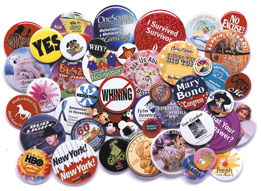
First of all, badges of networks and communities make a site look very unprofessional. Even if we are talking about awards and recognition badges you should place them on the “About Us” page.


My feedback:I truly agree! Even on my old blog, I will put all the badges/buttons into a running script which actually slides each badges/button vertically so that it doesn't clutter up my blog layout. As for my new blog now, I can't put in the script so I make do with putting all those badges/buttons in PhotoBucket, creating a slideshow from it and displaying the code link to the slideshow in my blog's static pages. You can find them at the following pages on my blog:

* My Blog Stuff!

* Cool Blog Memes

* PR Info!

So again, other than my own blog button which I put at my blog sidebar, the rest goes to the above pages.

Make sure to include contact details

Contact via  email

There is nothing worse than a website that has no contact details. This is not bad only for the visitors, but also for yourself. You might lose important feedback along the way.


My feedback: Totally agree again! Which is why other than the option to contact me via email, I also frantically searched for the commenting widget to put into my blog since my readers / visitors using IE8 are not able to submit a comment or email on my blog.

Avoid "drop-down" menus

The user should be able to see all the navigation options straight way. Using “drop down” menus might confuse things and hide the information the reader was actually looking for..


My feedback: Uhuh... actually, why I don't like this probably stems from my previous working experience in programming line. I used to write codes in RPG/400 a very dinosaur language (which are still mainly used in banking and financial institutions in Malaysia) and being a dinosaur language, to code a "drop-down" menu is not so easy, so yeah, I guessed it is one of the reason why I don't like seeing "drop-down" menus as well.

No horizontal scrolling

While some vertical scrolling is tolerable, the same can not be said about horizontal scrolling. The most used screen resolution nowadays is 1024 x 768 pixels, so make sure that your website fits inside it.


My feedback: Yeah, it gets tiring having to scroll up and down and then left and right...

If you use CAPTCHA, make sure the letters are readable

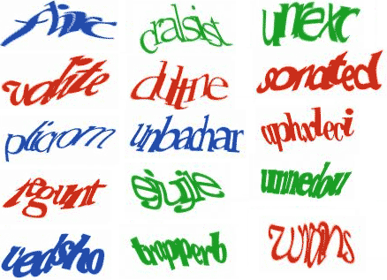
Several sites use CAPTCHA filters as a method of reducing spam on comments or on registration forms. There is just one problem with it, most of the times the user needs to call his whole family to decipher the letters.


My feedback: Yeah... actually I don't like having to key in CAPTCHA letters whenever I try to leave a comment but I will close one eye and just go along with it. Now, I get real annoyed when the letters shown are hard to read (yeah, maybe it's not your fault) but having to type over and over again it's really stressing... not to mention those blogs that sometimes reload for every action you take, like you key in your comment, then click submit or post, and it reloads with the CAPTCHA for you to key in, then you key in the CAPTCHA and it reloads with your preview which you will then click (finally) the submit or post button in order to leave your comment. Frustrating!

Okay, that's about most of the common things I encountered during my usual blog hopping activities. Other than the above, I also get annoyed when I hopped into dark colored background. Maybe it's just me, but I tend to stay away from dark background... it also makes reading hard and I really don't want to spoil my eyesight so fast... Hope you guys enjoyed the above and let me know what other common things you encountered as well!

(*Images are taken from Google search)

How To Exercise Your Toddler's Brain?

~ Posted on Saturday, July 17, 2010 at 10:05 AM ~

Just because I have a very active toddler who is constantly running around doing mischievious things, it doesn't mean he's getting enough exercises. Especially exercises to his brain. Yeap... I'm talking about the human brain.

So ladies and gentlemen, today, I present to you a step-by-step visual guide performed voluntarily by my now 16.5 months old toddler on How to Exercise Your Toddler's Brain (*I wonder whether I can trademark this hehehe...) :

VISUAL GUIDE

INSTRUCTIONS & REMARKS

Step 1: Start by slowly lowering down your upper body.

Try to slowly make your body bow down to a 90 degree position - kinda like you are bowing down to somebody. 

Ensure your legs are straight and your hands should be slowly lowered down and touching the floors as you bow forward and downward.

For a first-timer, you can use a small stool or anything that you can sit on temporarily while you slowly adjust your body to the right position.


Step 2: No cheating by bending your legs!

Your legs must be STRAIGHT! (Or at least almost straight!)

Get up & try again until you got it right!!

Look at the picture of Ben on the left trying to cheat his way out of this.

Now, his hands positions are correct but the legs like I mentioned MUST be at least almost straight.

Step 3: Once you achieved the right position, stay still and hang on as long as possible.

Look at the hands and feet now both touching the floor, while the head is gently resting on the floor as well. Now back to this, what we're trying to achieve is to get the bloods to go down to the brain. According to this website,

"Although the brain represents only about 2% of the body's weight, it utilizes about 20% of the body's oxygen. Normally, oxygen is carried throughout the body via the bloodstream. When the flow of blood is reduced or blocked, cells which depend on that bloodflow are deprived of oxygen (and other nutrients)"

Which is why this position is so ideal to get the blood to go to the brain! More blood = more oxygen!

Step 4: Why not throw in a face exercise too?!

While you are still holding up from step 3, why not throw in a face exercise as well? Just smile or laugh while you are trying to hold still to your position for as long as you can.

According to this website:

"Laughter generally increases activity within the immune system. It also decreases stress hormones that constrict blood vessels and suppress immune activity."

Step 5: Rest

Just like in yoga they have a resting pose, we too need to have a resting pose after exercising the brain!

So, just do what is shown on the left by Ben.

Rest all you want! You deserve it after such a hard workout to the brain! Laughing

(**Note: Parents should always be around at all times to supervise your toddler regardless what stunts he's trying to perform... and yes, this post is just to poke fun of the silly antics by Benjamin, please don't take it seriously, OK?!)

What is Gravatar?

~ Posted on Wednesday, July 7, 2010 at 6:23 PM ~

Ladies and gentlemen, I feel I really should share out this with you guys. It's definitely not a professional lesson, more like a mini tutorial from me, a knowledge transfer I'd say. I think from now on, if I learned any new things that I can think can benefits you guys who are passionate about blogging, I'd like to share it out through my own blog meme, which is:

So, what is a Gravatar? No, no, not Avatar. I meant, GRAVATAR. With the letter "GR" in front. According to the website,

"Gravatar is an image that follows you from site to site appearing beside your name when you do things like comment or post on a blog. Avatars help identify your posts on blogs and web forums, so why not on any site?"

Errmm... does any of that make sense to you? Put it to simple lay-man words, Gravatar is an icon that represents you, an image in this sense that whenever you go to other people site or when you leave your comments, your icon/image will appear right where your identity is. If you are using Blogger, then your profile picture will be the one showing. But you see, nowadays, Blogger is not the only thing available for people to use on their blog or website. There are Wordpress and other blog host as well. So this is where Gravatar comes in handy.

If you noticed my blog, some of the people who left their comments have this funny looking images next to their profile:

Now it's definitely not my blog visitor / reader's choice to have that funny looking image as their profile picture. It's just that I like to imagine the people who left me a comment really looks funny like that hahaha... kidding kidding...

Back to being serious, now this is because on my blog template, it is defaulted that comments are to use Gravatar images to show the user's profile. If the person's email address is not found in the Gravatar's database, then this funny looking images will be shown - cos this is from the Wavatar settings in my blog template.

Meaning, when you leave me a comment, my blog template will search the Gravatar database using your email address. If they finds it, they will show your image next to your comment in my post. Else, the funny Wavatar icons will be shown. There are many other websites and blogs out there and a lot of them are using the same method, only that most of them choose Monster ID or Identicon instead of mine, which is Wavatar.

Monster ID icons looks like these:

Identicon icons looks like these:

As I'm no longer using Blogger, I cannot use the user's Google profile picture to show on their comments, hence Gravatar is the best choice. When you leave a comment on my blog post, you will notice a short description right next to the email entry which says " (Will show your Gravatar icon) " - this is because Gravatar extracts your image using your email address. I can of course select MonsterID or Identicon to show as your profile image but I prefer to use Wavatar instead. 

Simply put, to create your profile on Gravatar, you just need to enter your email address and upload your image into their site. Easy peasy! Of course, just a note of advise, if you are serious about blogging and establishing your own identity and also your blog identity, you'd want to design your profile image as close to your blog template. This is to make people associate the image with your blog whenever they see it!

You can click at this link to start creating your own Gravatar now! That's all the mini tutorial I have for now. Will post more when I came across any new stuff! Or feel free to drop me a comment or email and if I know how to do it, I'll be glad to share it in the next post, else I'll try my best to find out if I don't know about it. Cheers!